The smart home market has growing pains.
Despite the thousands of home-control apps on the Apple and Google Play stores, each one is practically identical.
Instead of competing directly, companies have developed tons of small, incompatible ecosystems. This has left little incentive to develop meaningful or unique experiences, just convincing marketing.
Sunrise is a vision for experiences that supplant the ecosystem; a 3-month UX design project, culminating in an interactive prototype and presentation.
Designed to prove that, by refocusing on a user's story and not the underlying hardware, smart systems can elegantly embody complex user goals.
Piles of menus and toggles.
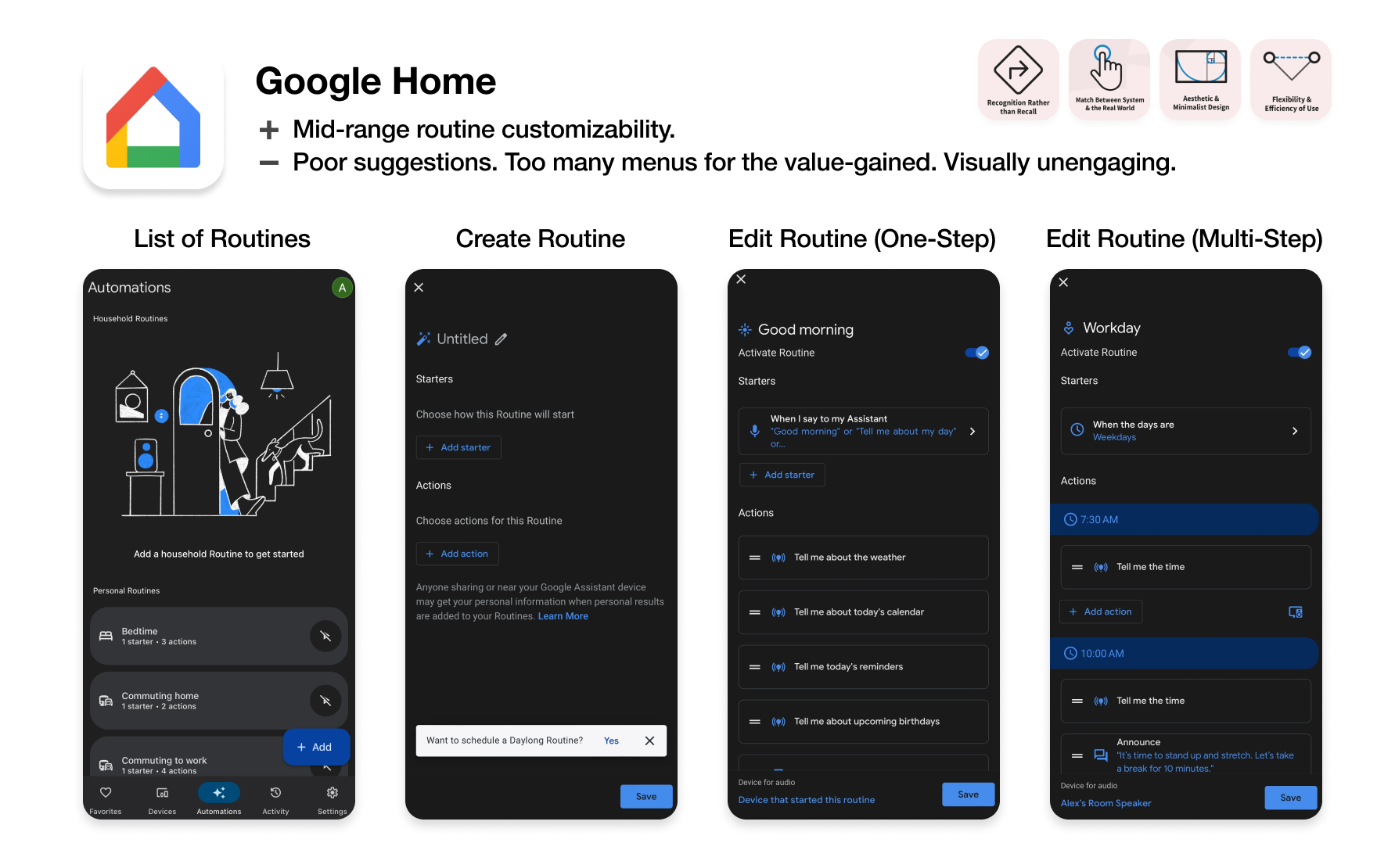
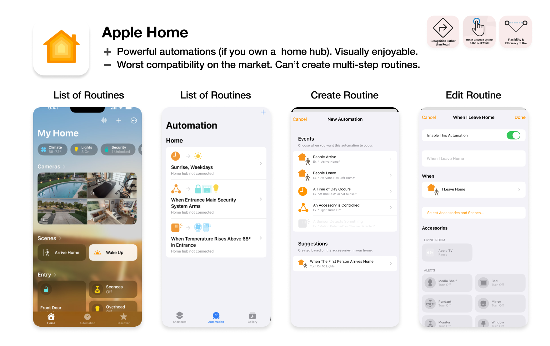
Usability issues have led the majority of smart device owners I surveyed to avoid creating home automations entirely, despite the fact that most highly valued the convenience of automation.
Convenience through automation is one of the primary selling points for smart home products. Yet, software is often limited to the most basic automations, with even the richest tech companies unable to provide basic automation approachably.
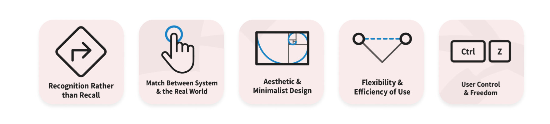
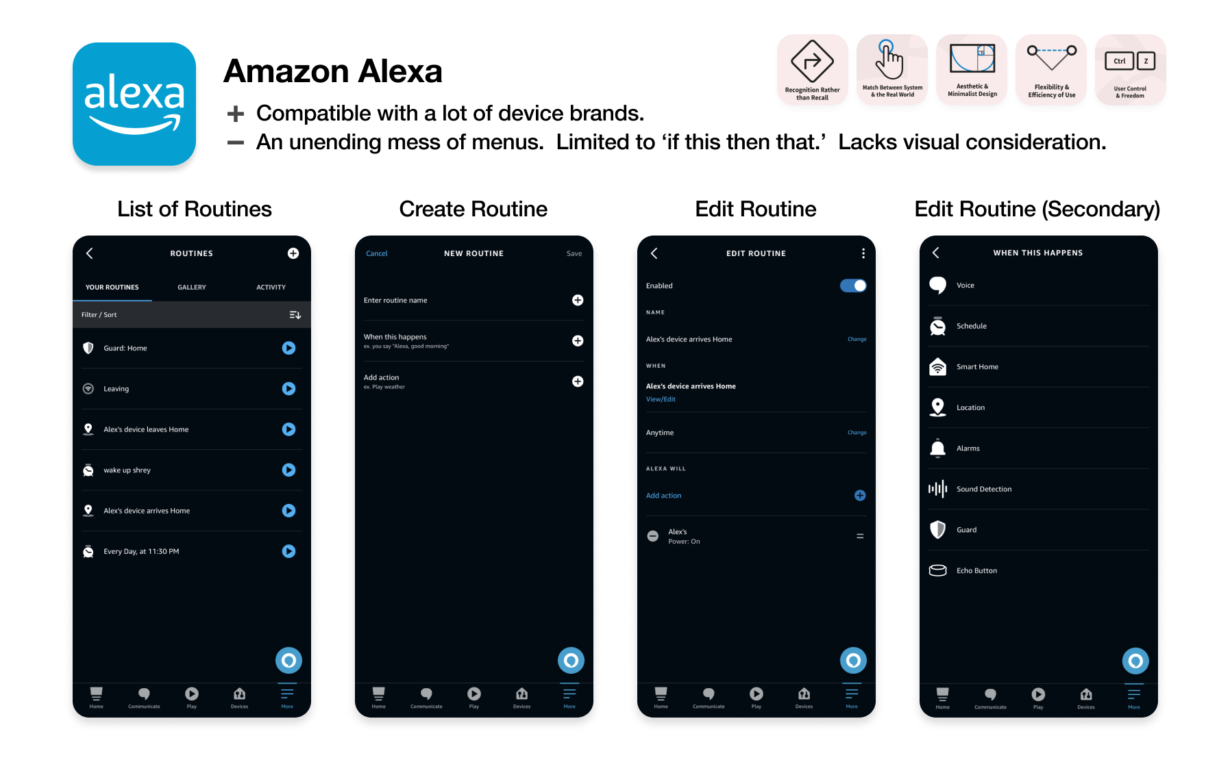
Some critical heuristic issues I identified in the largest three apps, in collaboration with those surveyed:
Currently, there appears to be a trade-off between compatibility, power, and usability. This is not an inherent limitation, though. Open-source libraries can easily bridge those gaps when implemented. The trade-off is the failure of a hardware-only market structure.

Where can we go from here?
There's more room than ever to challenge the preoccupation with hardware. Instead of building from the infrastructure up, let's start with a key experience and build top-down.
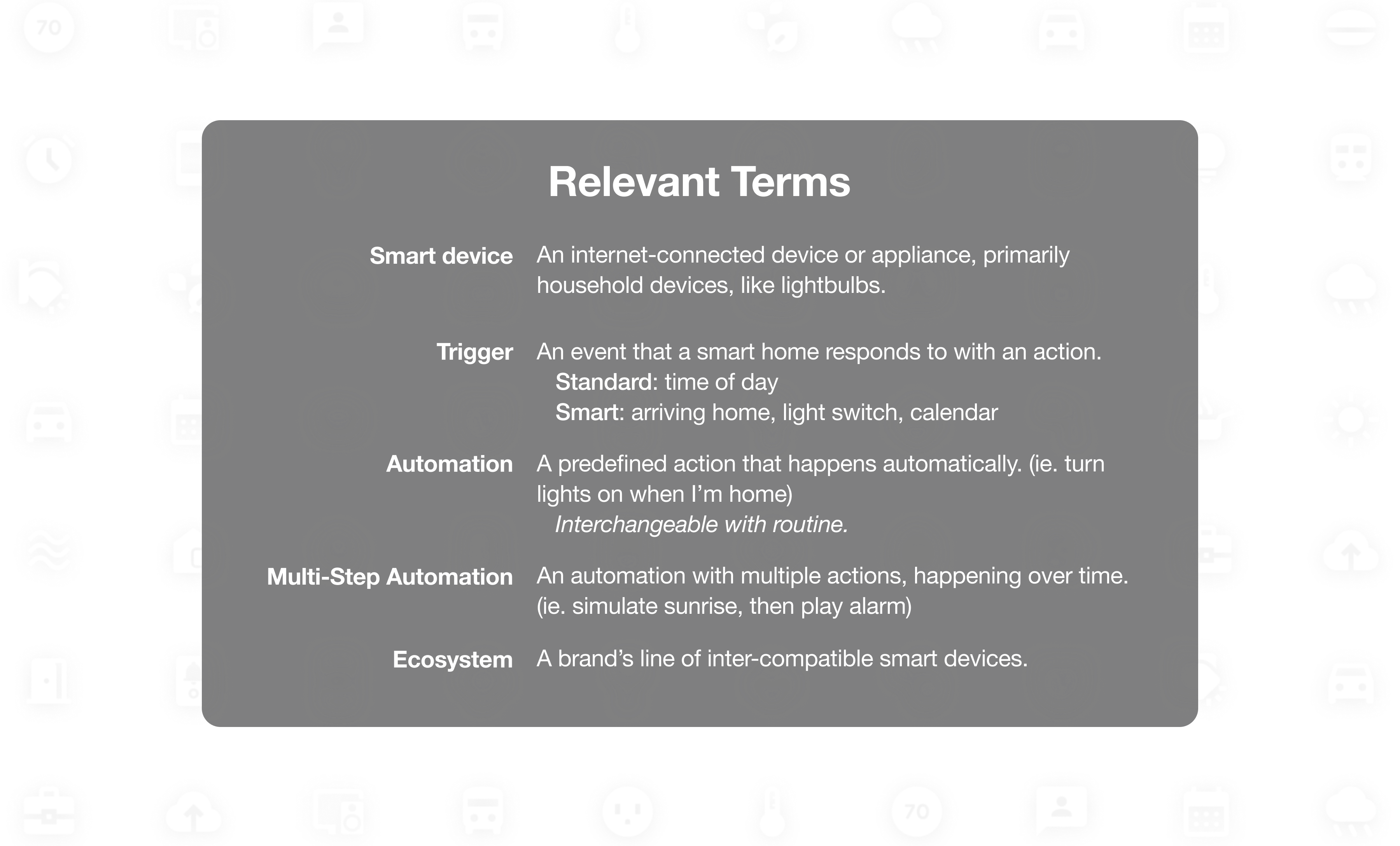
Since it's the most powerful, worst implemented aspect of smart home software, I decided to tackle the crux of the problem, automation. Automation is not an actionable user goal, though. An actionable goal would be, for example, falling asleep easier or staying focused throughout the day. For this project, I wanted to enable users to create the perfect morning.

Morning routines can be difficult. Over time, I've found that sunrise alarms, a good playlist, and transit reminders make a big difference for me. However, setting these things can be a huge chore. If my schedule changes at all, that means adjusting each step individually. No one I surveyed had the patience to do so.
Especially for people with limited space, light, or time, every convenience and spark of joy counts in the morning. That's why morning routines are a perfect environment to illustrate automation's benefits and maximize return on usability investment.
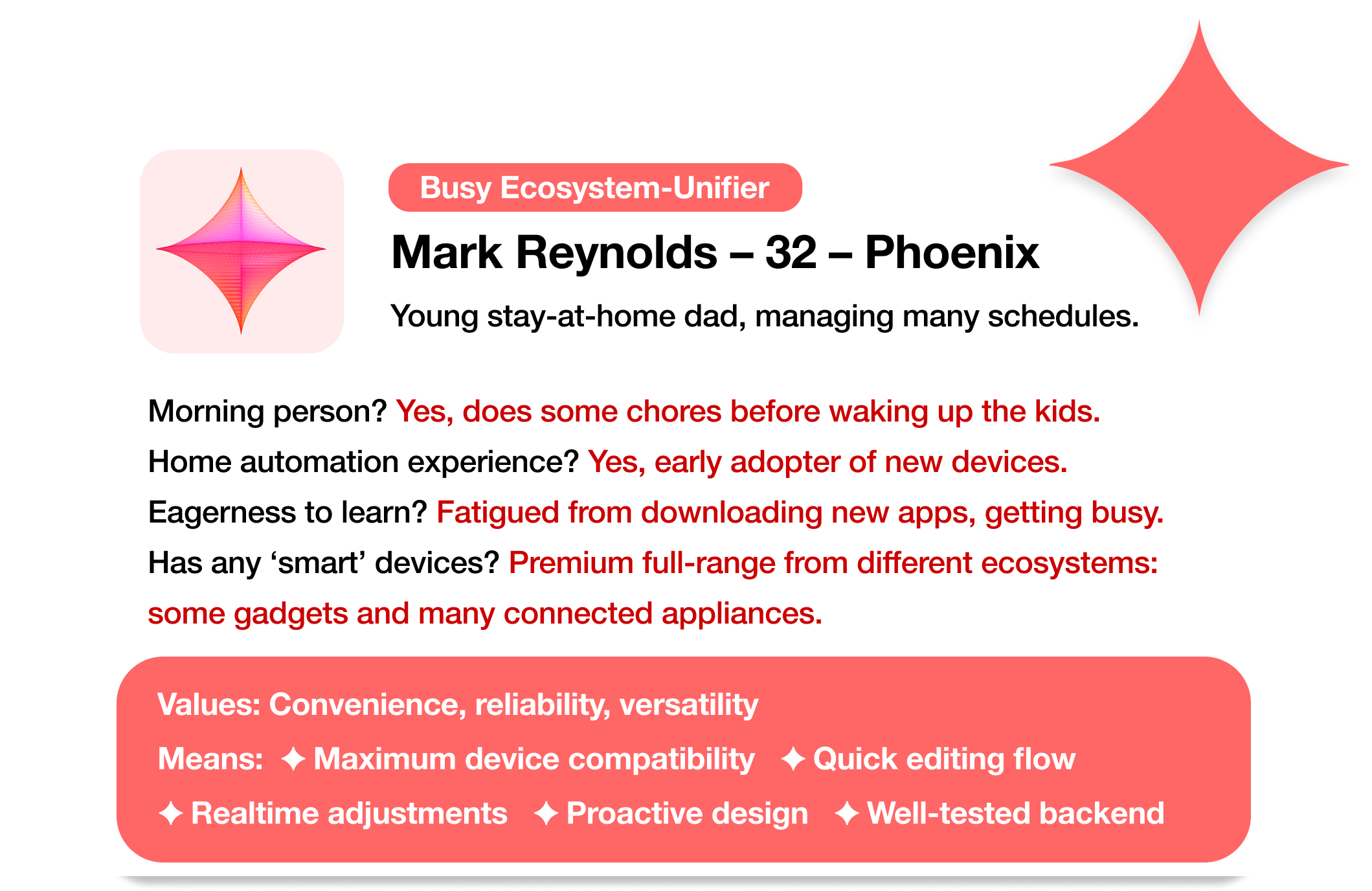
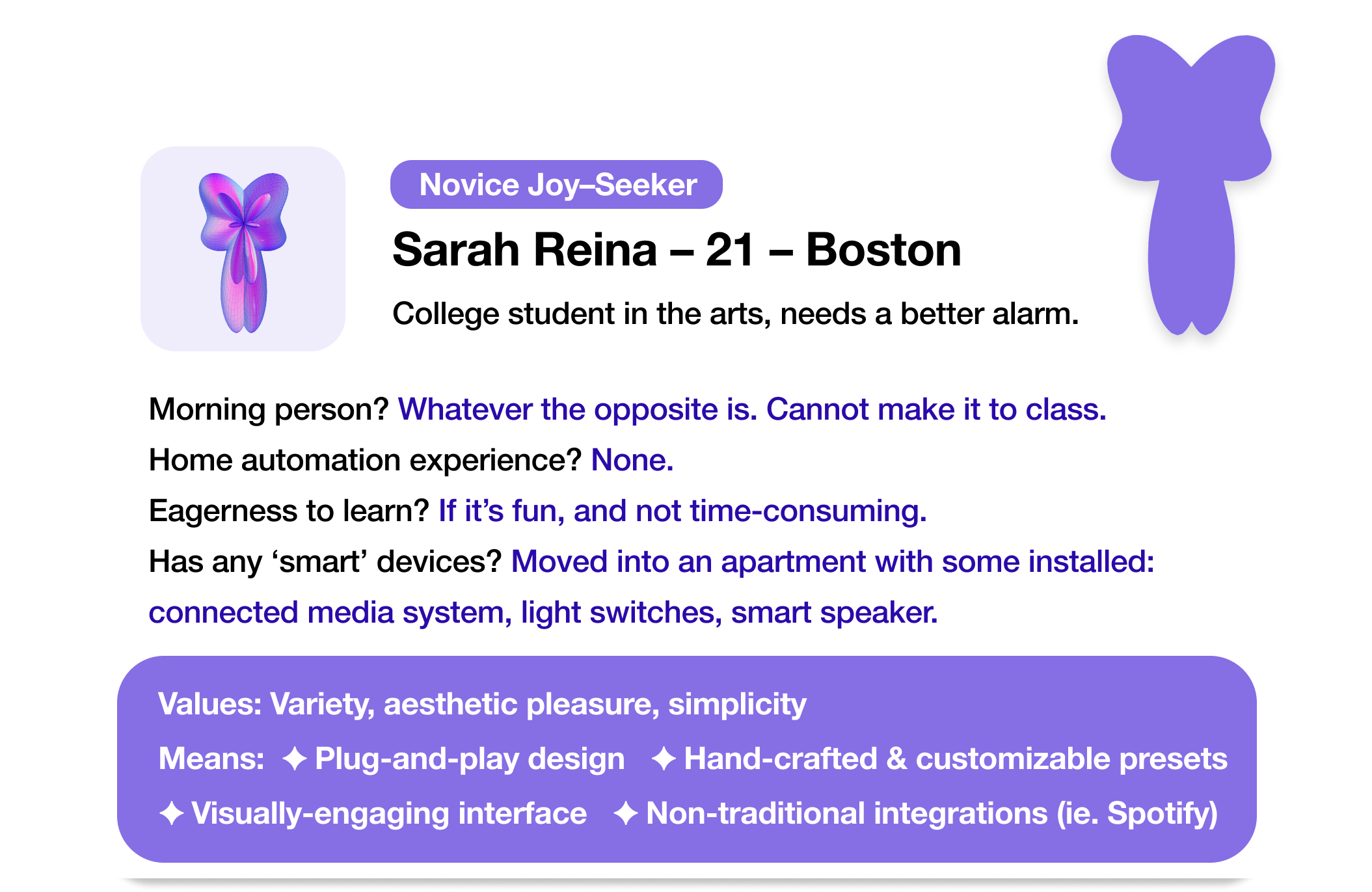
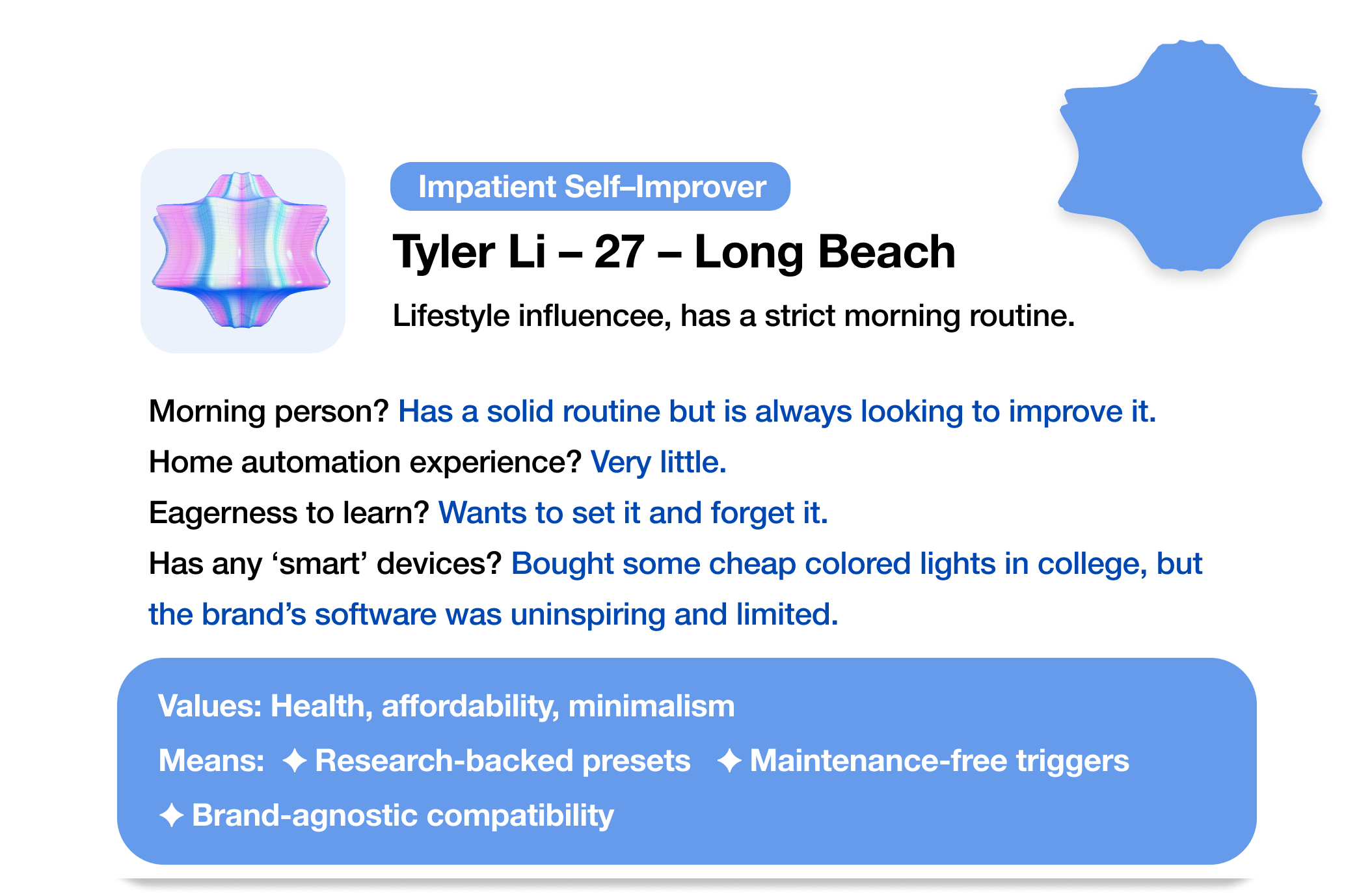
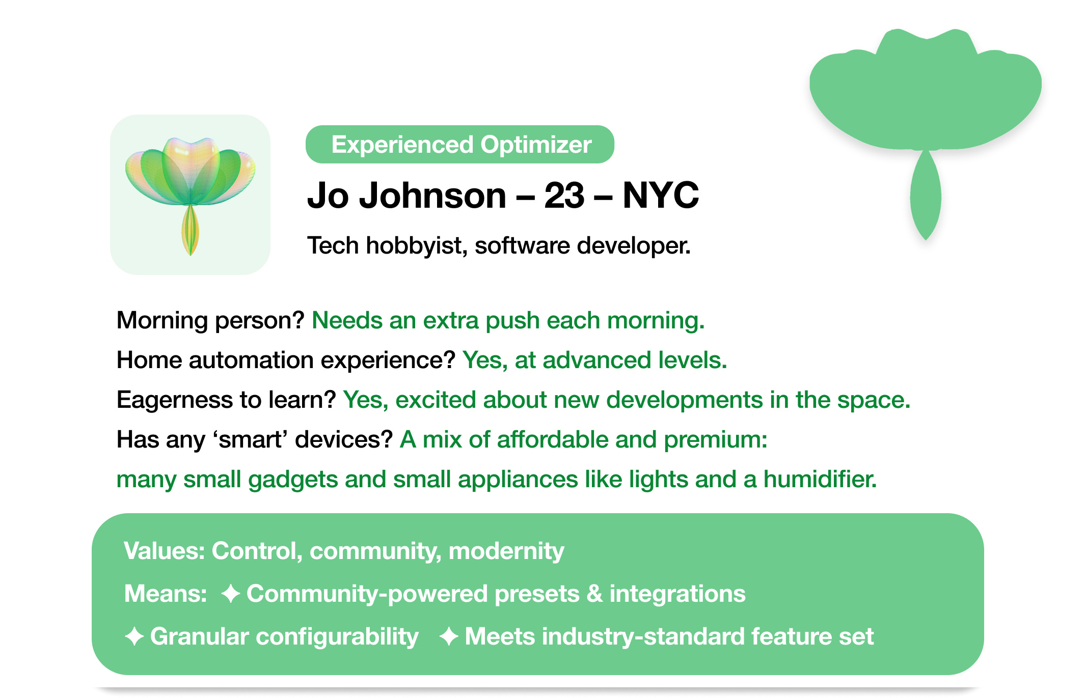
The aspiring morning person.
I sketched out a few personas of potential users, based on my conversations with smart device owners and review of outspoken users on online smart home communities.
These archetypes helped pinpoint the potential cornerstones of a minimum viable solution. While they start in very different places, the current home-control software landscape is failing each persona similarly.
The unifier was a need for approachability; software whose complete value is widely accessible, requires minimal investment, and is self-evident.
Creating the personas, I had already arrived at one strategy for approachability- presets. The majority of people I talked to did not want to start with a blank page. They reported a unanimous preference for pre-made configurations. Not only attributed to the convenience, but also for the credibility of potential professional advice.
In Sunrise, presets would be pre-made, multi-step actions for a device category, like simulated sunrises, that users can just plug-and-play. Preset designers can easily target a variety of demographics (family-oriented, health-focused, etc), and drastically reduce the user work needed for personalization.
The context problem.
As pointed out in the heuristic evaluation, the current UI visually isolates users during decision-making. Taking a top-down approach, we can see why this is a critical usability problem.
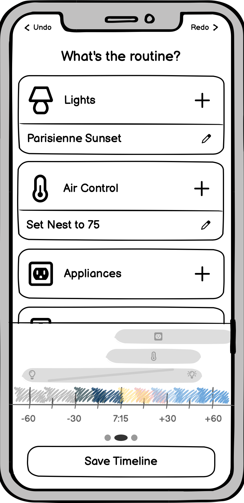
When creating a routine that unfolds naturally, a user must place actions relative to others over time. However, mainstream interfaces treat time as a data point, not as a linear experience. Without human-oriented visual feedback, scheduling a routine requires exponentially more cognitive load with each new action.
Imagine trying to schedule a whole day in a calendar app that doesn't have a calendar view! Bare menus and toggles are just as incomplete of a solution here. To give users the needed context for decision-making, we need a persistent visual timeline.
A timeline helps us solve the menu-bloat problem, as well, allowing us to unify action creation and editing into a single, dynamic timeline editor.


Usability Testing
Over the course of the design process, I performed a number of tests with peers to check-in on my design decisions. They were asked to complete specific goals on both a working prototype of Sunrise and a mainstream app. I observed without interfering then asked them to reflect on preferences, issues, and suggestions.
75% (12/16) reported a preference for the Sunrise interface in accomplishing relevant goals, and 94% (15/16) reported a preference for a timeline-based interface for all automation goals.
The testing and reflections gave me a few key insights which informed the product's evolution.
Balancing beauty and simplicity.
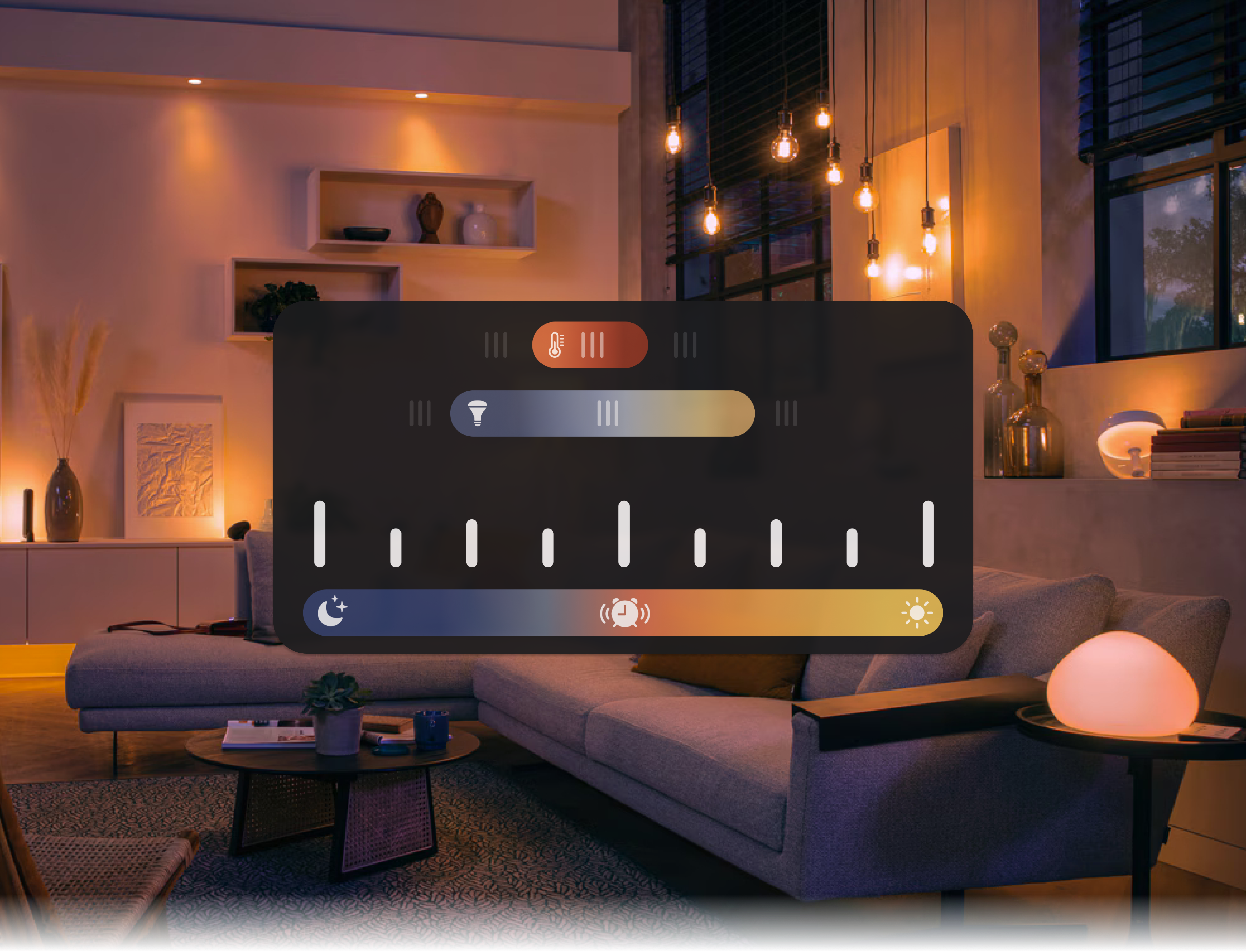
Sunrise is a morning routine designer. It celebrates the natural beauty of the sun, sky, home, and routine. Everyone should feel welcome and encouraged to discover, experiment, and play.
Here, aesthetic consideration is not a secondary concern. It conveys the aesthetic value of routines and is an instant differentiator from the competition.
And without the bloat of the 'one-stop shop' mindset, there is plenty of room to make bold visual choices while upholding a minimalist standard.


Setup
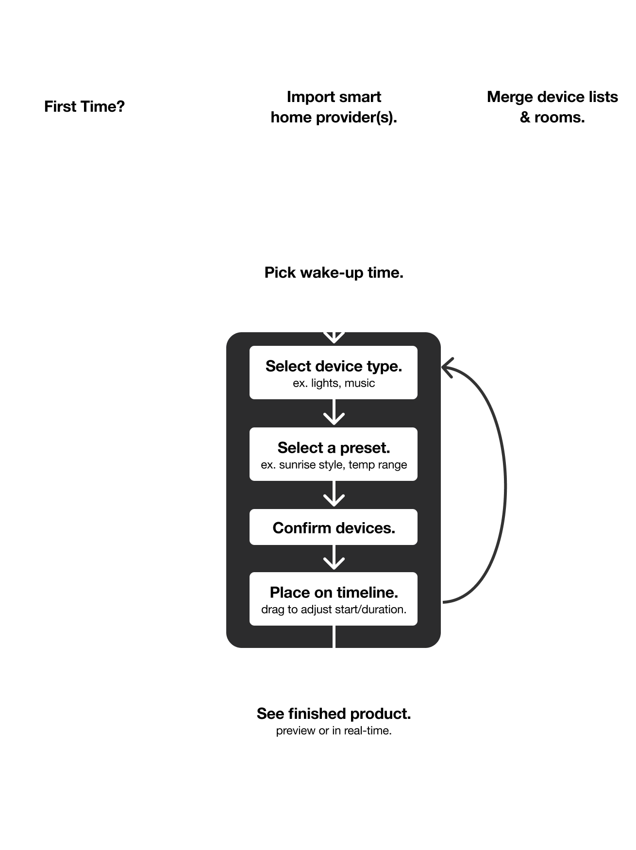
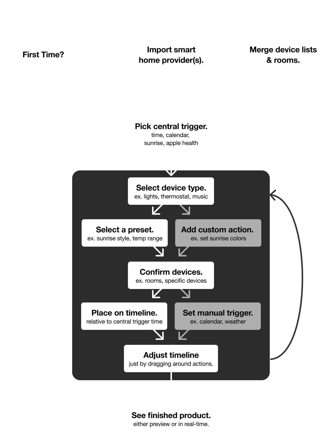
Ecosystems are automatically merged into a unified home, inheriting names and groups for a plug-and-play setup.
Start
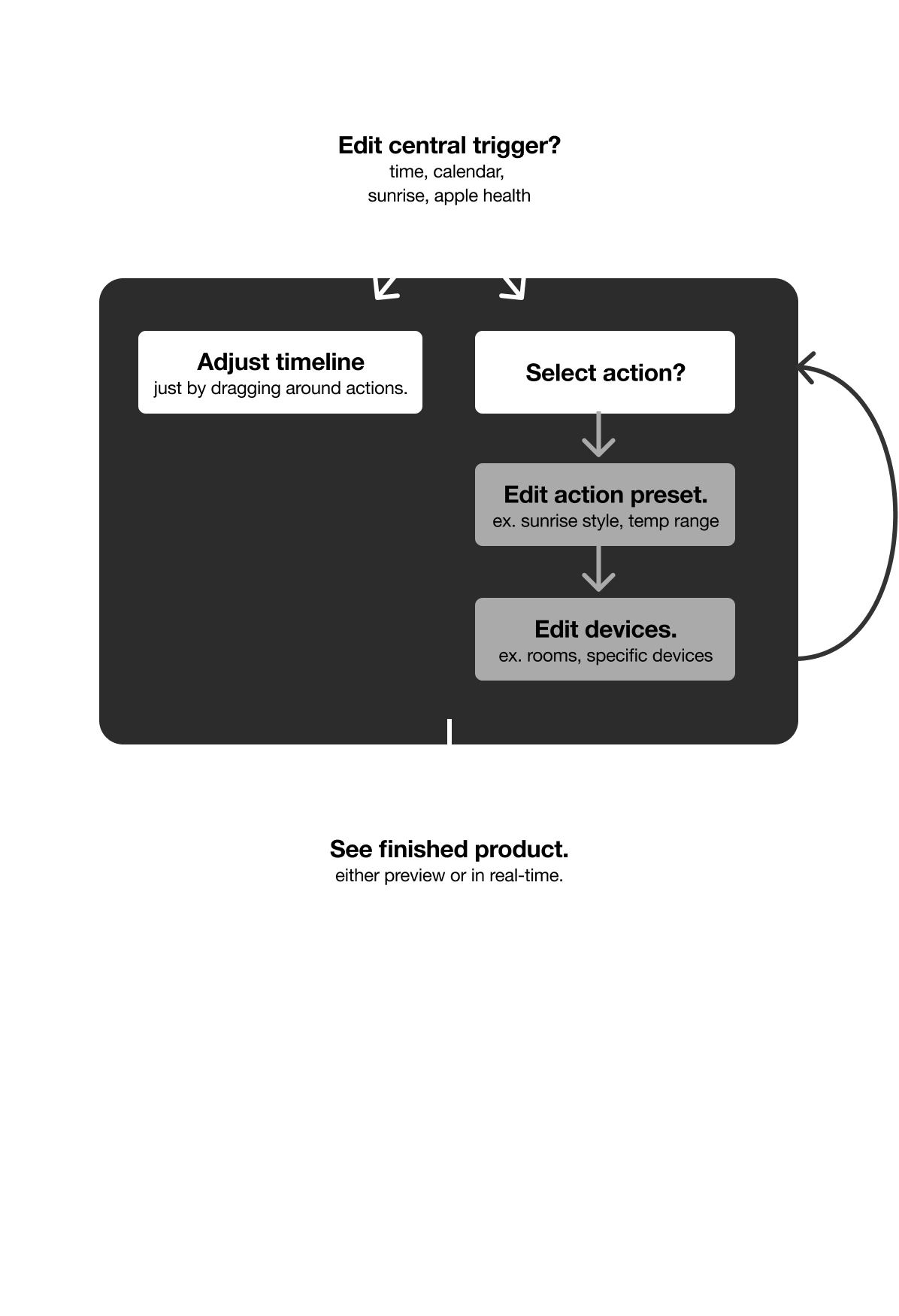
The wake-up trigger is the centerpoint that a routine is built around. Picking it first allows routines to be rescheduled in an instant.
With opt-in smart triggers, routines can adapt in the background to changes in your alarms, calendar, etc.
Select
No learning curves. Focus on creating a morning you'll love. Select from a number of illustrated, hand-crafted presets that automatically adjust to your setup.
Select multiple to rotate between options, especially useful with music integrations.
Arrange
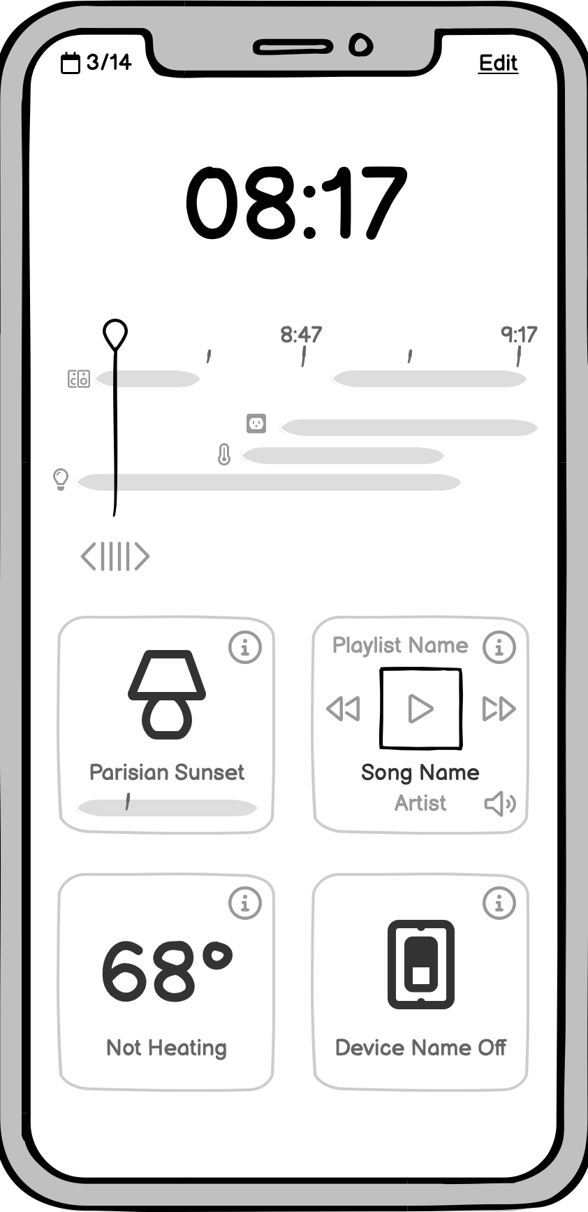
Instead of doing data-entry, the timeline let's you seamlessly choreograph your routine. It's a tactile, intuitive way to interact with time: just tap, stretch, and drag.
Review
For the first time, complicated automations are legible in a glance.
Respond
When something comes up, you don't need to compromise your routine. Jump to the end or scrub backward. Skip a song, switch the playlist, or blast the heat.
(Technical Feasibility)
For all but the ecosystem API integration, the app would be very straightforward to put together with Swift or React Native, plus a remote server to run the automations.
With current technology, broad and reliable compatibility would require the use or adaptation of an open-source server like HomeAssistant or HomeBridge. For a minimum viable product, the big three ecosystems (Amazon, Google, Apple) could be unified reliably through the cloud: no additional hub or setup required.

Balsamiq
First round of wireframing and visual prototyping.

Figma
Designing the HiFi interfaces and creating interactive prototype.

Illustrator
Creating material-style icons and performing icon alterations.
Lessons Learned
Going from idea to interface, I've learned how to put usability goals, business objectives, and visual identity into conversation. I developed a more holistic understanding of UI/UX design, and ultimately gained an enthusiasm for a product that I truly believe can bring meaningful accessibility to a market that is lacking it.
Download .fig